Understanding the challenge
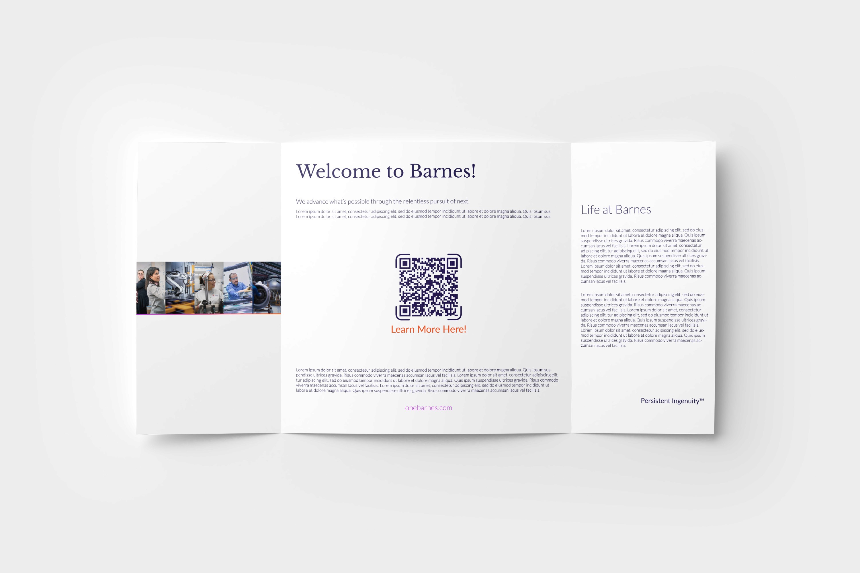
The main challenge was to create a trifold brochure that was visually appealing while clearly presenting Barnes’ information. I needed to balance text, images, branding, and white space so the design remained professional, organized, and easy to read.
Designing a seamless experience
I created a consistent visual flow across all three panels by using cohesive colors, typography, imagery, and spacing. The layout guides the viewer naturally from the introduction to the company information, while keeping the design clean, professional, and easy to navigate.